A/B Test
PROJECT FOCUS
Along with the pizza products, the side menu plays important role for increasing ATP (Average Ticket Price) per customer. Among the various side menu items, the “600yen for Any 2 Sides” have been an important upsell for a long period of time, and have been contributed to increase the total sales as well.
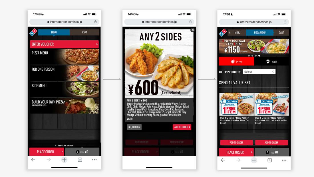
We’ve found that users have commented that 600yen for Any 2sides pop-ups are annoying from qualitative surveys. That pop-up displays between Menu Top page and Pizza Menu page.
OVERVIEW
GOAL & UX Planning
To improve user experience and in response to that comment, we conducted the following tests.
We hypothesized that the user may feels less uncomfortable if pop-ups do not fill the screen completely. Also, most of pop-ups displays at unexpected times from users perspective. By increasing visibility of the Pizza Menu screen which is supposed to seen as next step, pop-up could perceived as less disruptive to users.
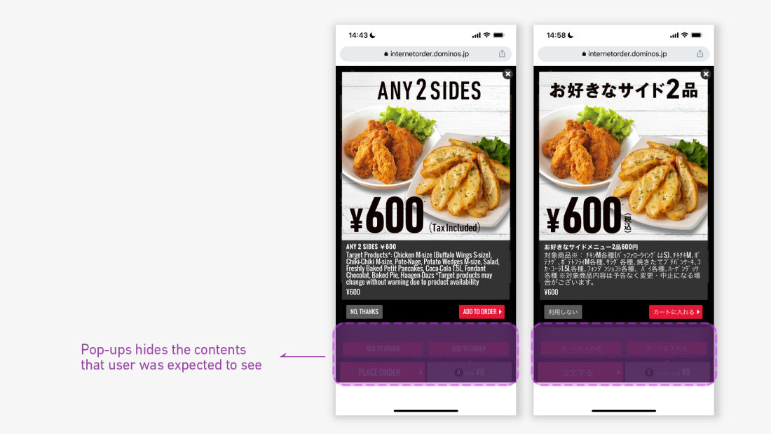
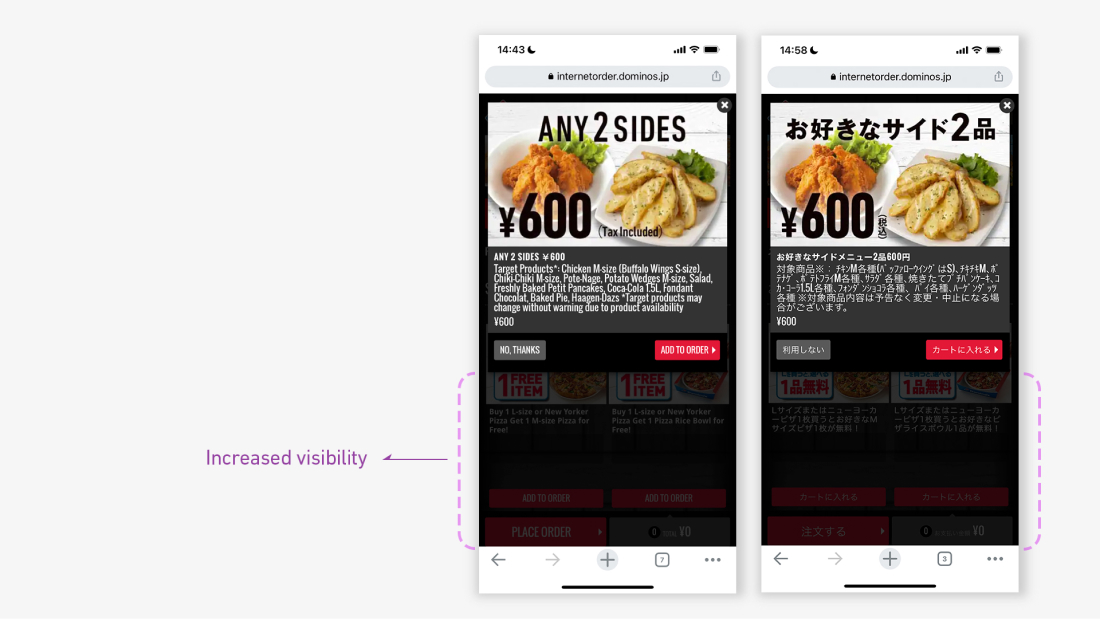
Therefore, we shortened the height of pop-up so the Pizza Menu page can be seen more. (variation 1 below) When pop-up displays the rest of screen turn to darker, however users still can see the next step. Height adjustment increased visibility of screen
In addition to smaller pop-ups, we also implemented the variation 2 as “No pop-up display at all” in this test (Even if user did not choose the “2 sides ¥600” when it shows, it’s available to add the same item later anyway).
- Control
- Variation 1 (Smaller pop-up)
- Variation 2 (No pop-up))
RESULT
Variation 1 showed higher performance compared to Control and Variation 2. Variation 1 drove +0.5% CVR boost and +¥20 per Session value (compared to control). Interestingly, Variation 1 performed even better than Variation 2.
MY ROLE
Research – Shared the qualitative survey result
Ideation – Variation 1& 2
Direction – design execution
TOOLS
Photoshop
WORKED W/
Growth marketer
Designer
CMS operator
WHEN
2021 Nov.